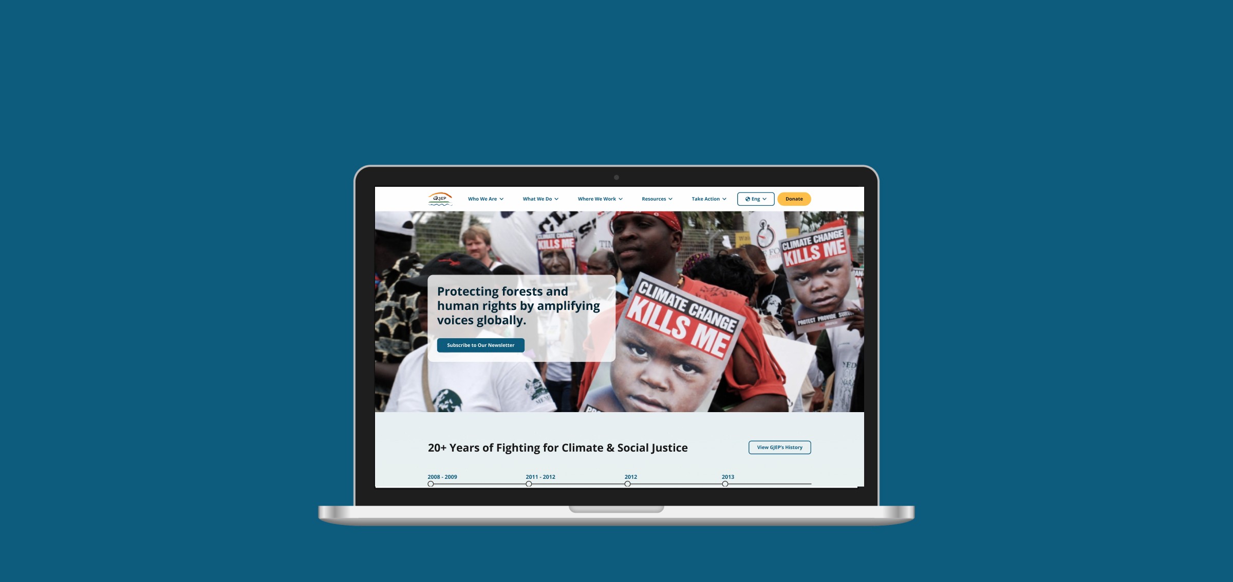
Revitalizing Trust: Redesigning a nonprofit's website for clarity and action
Overview:
The Global Justice Ecology Project (GJEP) is a nonprofit organization addressing social, ecological, and economic injustice. Our team was tasked with redesigning their website.
The Challenge:
From 2021 to 2023, total online donations decreased by 10.54%, averaging an annual decline of 18.35%. Users struggled to understand the organization’s mission, which led to a lack of trust and engagement, contributing to the decline in donations.
The Goal:
Boost donations and signups by building trust, clarity, and credibility. In this case study, I’ll walk you through our process of redesigning key elements of GJEP’s website to clarify its mission and enhance transparency, fostering a sense of trust among users. We concentrated on improving navigation, visual design, and donation transparency, ensuring users felt empowered to support GJEP’s work.
Project Duration
February 2024 – July 2024
My Role
UX Designer
What I did:
UX: As part of a 5-person UX design team at TechFleet, I implemented insights from research to create wireframes and a high-fidelity prototype of the website with more than 20 pages.
Collaborated with research to review usability testing sessions and conduct card sorts for updated navigation.
UI Design: Ensured a modern and consistent visual style to build credibility and trust.
UX Writing Collaboration: Worked with UX writers to implement clear and concise copy aligned with the mission.
Design System: Developed a design system for consistent UI components, facilitating seamless collaboration with developers.
Met with GJEP’s VP of Product and Web Developer to ensure designs met technical standards.
User Research: Discovering pain points via usability testing and interviews.
Pain Points and Needs:
Lack of Mission Clarity
Users struggled to understand GJEP’s main purpose, with some thinking it was a news site, others an academic resource, and some focusing on fundraising.
User Need: Users need clear, consistent messaging to immediately understand GJEP's mission and focus on social and climate justice.Establishing Organizational Credibility
The outdated design and mismatched visuals made users question GJEP’s professionalism and credibility, leading to distrust.
User Need: Users need a modern, professional website that visually aligns with GJEP's credibility and long-standing legacy to build trust.Lack of Donation Transparency
Users were unsure how their donations would be used, making them hesitant to donate due to a lack of transparency.
User Need: Users need clear, detailed information about how donations are allocated and how their contributions support GJEP’s mission.Ease of Access to Information
40% of users struggled to find articles, and those who did took an average of 58 seconds, indicating issues with the site’s navigation.
User Need: Users need a more intuitive navigation structure to quickly and easily access articles and other important content.User Pain Points and Needs
Design Solutions
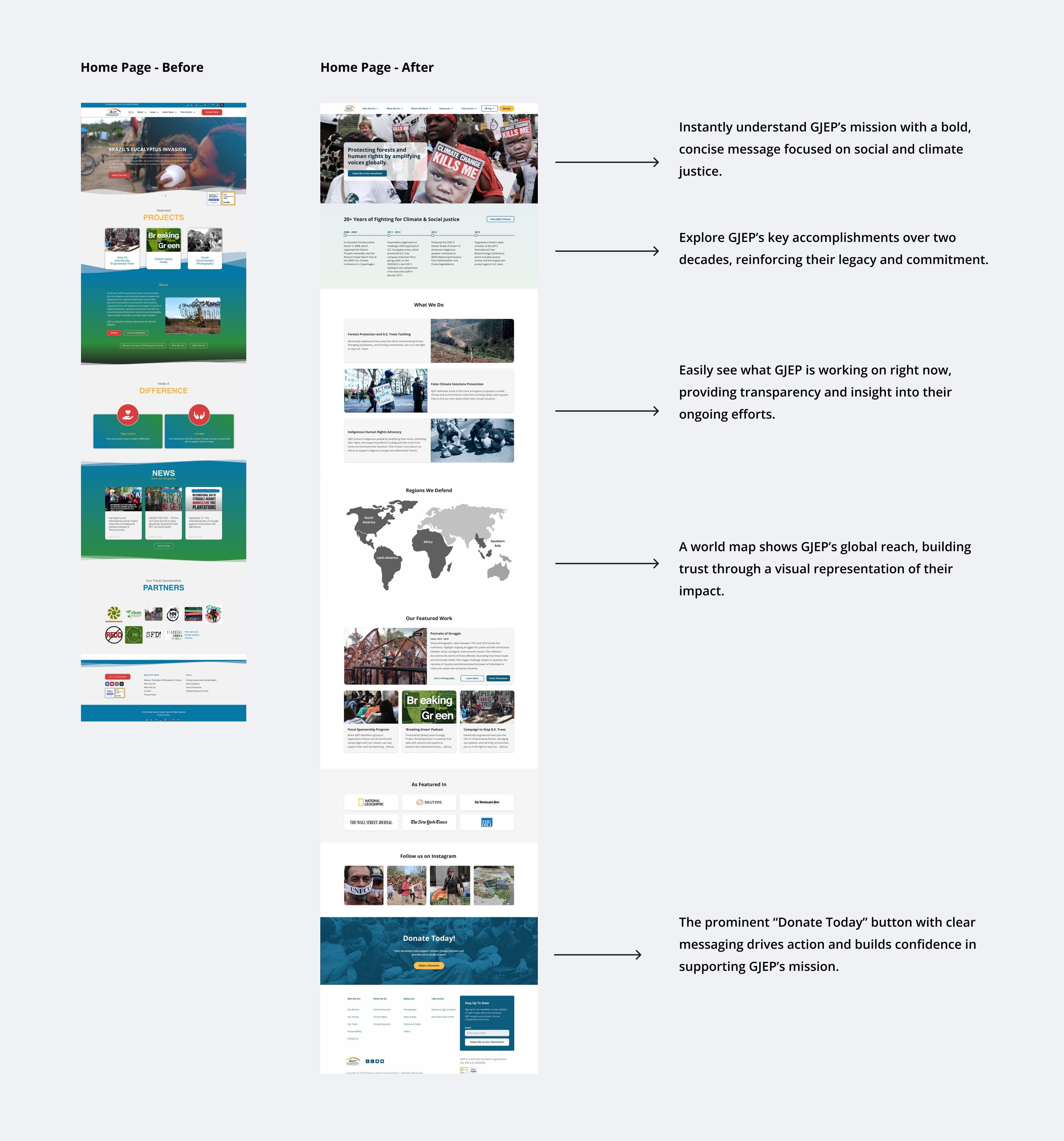
Solution 1: Highlighting clarity and visibility of GJEP’s mission and history.
The original homepage lacked a clear presentation of GJEP's mission, goals, and impact, which made it challenging for users to establish trust and engage with the organization.
Changes Implemented:
Highlighted GJEP’s mission and core values to reinforce their commitment to social and climate justice, enabling users to quickly understand the organization’s purpose.
Featured 20 years of impact, showcasing key accomplishments and milestones to build trust and provide context.
Utilized engaging visuals and storytelling to create an emotional connection and emphasize the organization’s legacy.
Improved content structure for better readability and easy navigation of essential information.
Integrated prominent calls to action to drive user engagement and encourage support for GJEP’s initiatives.
Solution 2: Increasing scannability and streamlining content discovery.
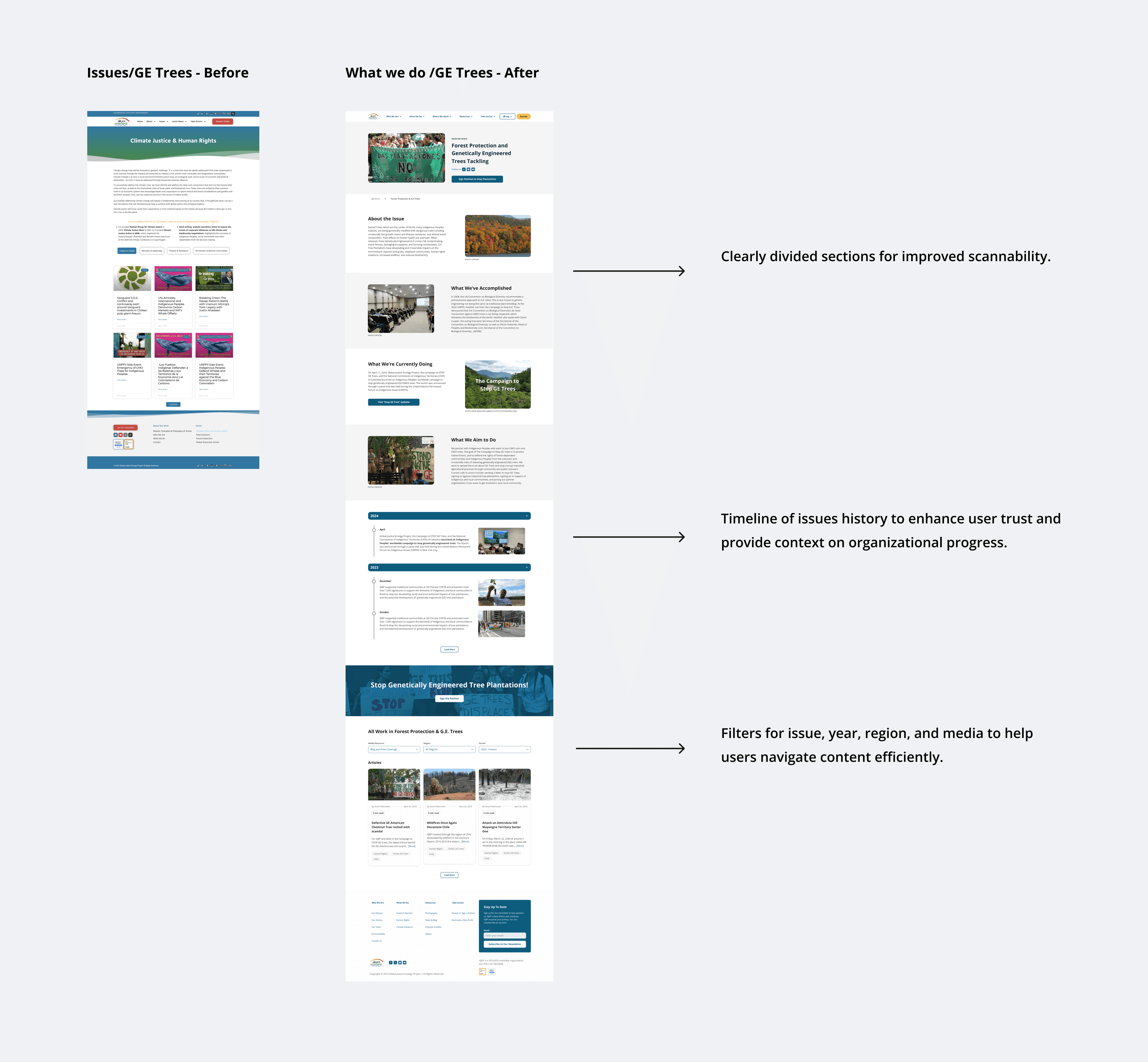
The dense content structure of the Issues page made it time-consuming for users to find relevant information.
Changes Implemented:
Established clear categories like "About the Issue," "What We Did," and "Where We Are Now" for easier information digestion.
Created a timeline of issues history to build user trust and provide context on organizational progress.
Enhanced visual hierarchy with bold headings and imagery for improved navigation.
Implemented filters for issue, year, region, and media to facilitate content discovery.
Introduced strategic calls to action to guide users toward deeper involvement in the mission.
Solution 3: Increasing donation transparency
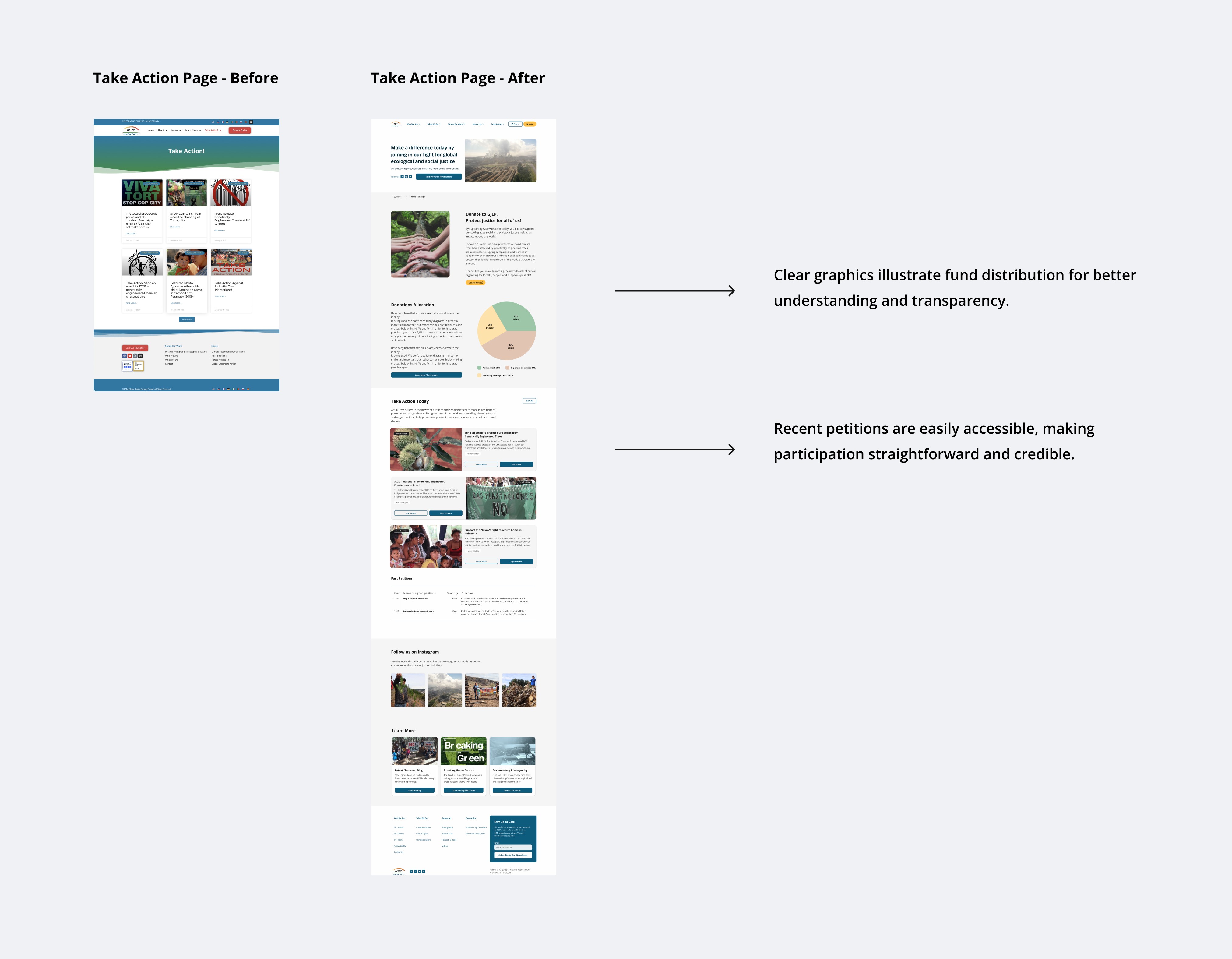
The "Take Action page lacked clarity on how user contributions were utilized, leading to concerns about the impact of their involvement. Additionally, too many petition options created choice overload.
Changes Implemented:
Revamped the Take Action page to clearly outline options for donations and petitions, ensuring users understand how their contributions make a difference.
Incorporated infographics to illustrate how donations are allocated and the specific impact of each contribution on GJEP’s mission.
Introduced detailed descriptions of ongoing petitions, emphasizing the urgency and importance of user participation in advocacy efforts.
Solution 4: Modernizing the visual design for credibility
The original visual design lacked professionalism and consistency, undermining user trust and credibility.
Changes Implemented:
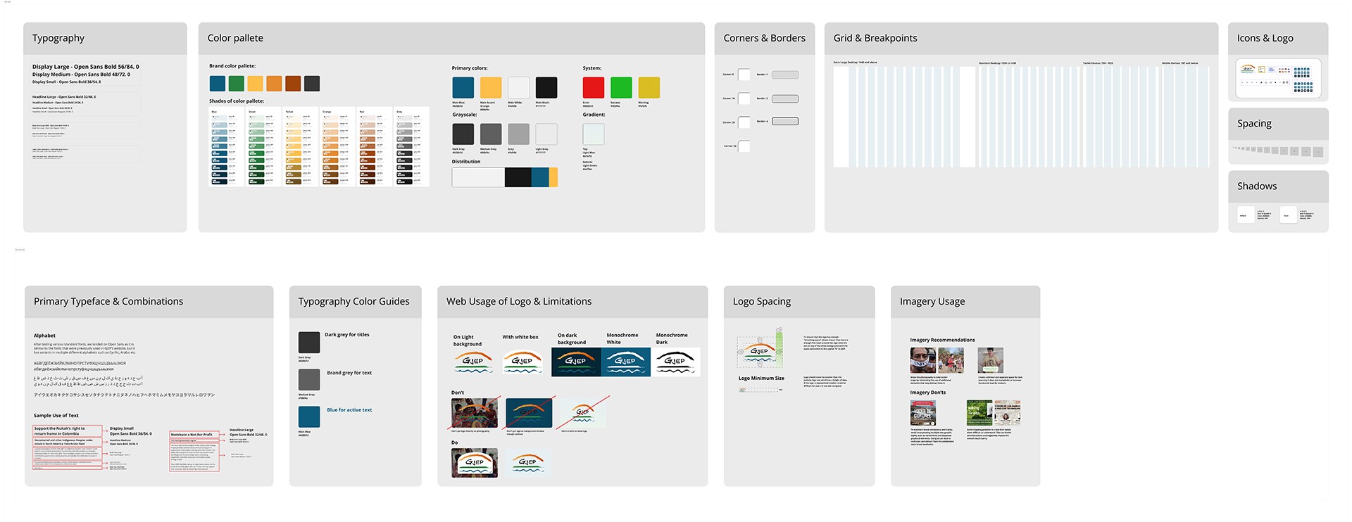
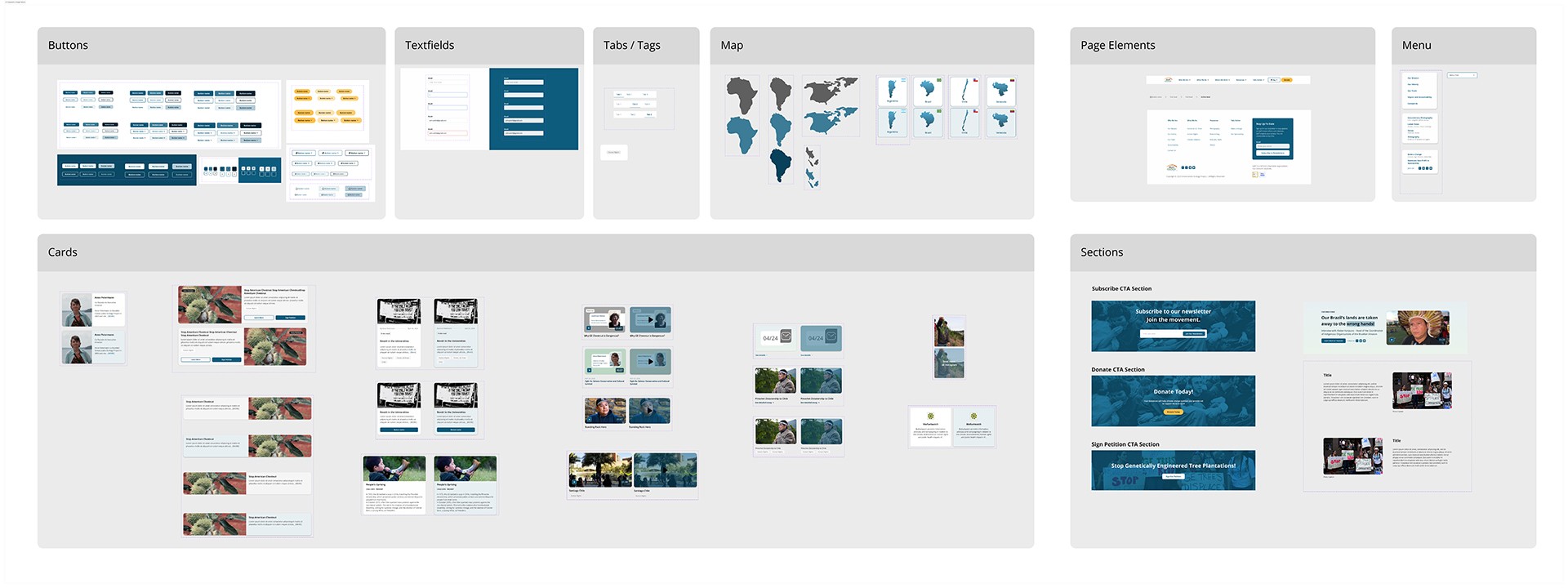
Developed a comprehensive design system and UI kit to ensure consistency in visual elements across the site.
Implemented a modern, professional design that reflects GJEP’s mission and values, enhancing credibility.
Enhanced accessibility features to create a more inviting experience for all users.
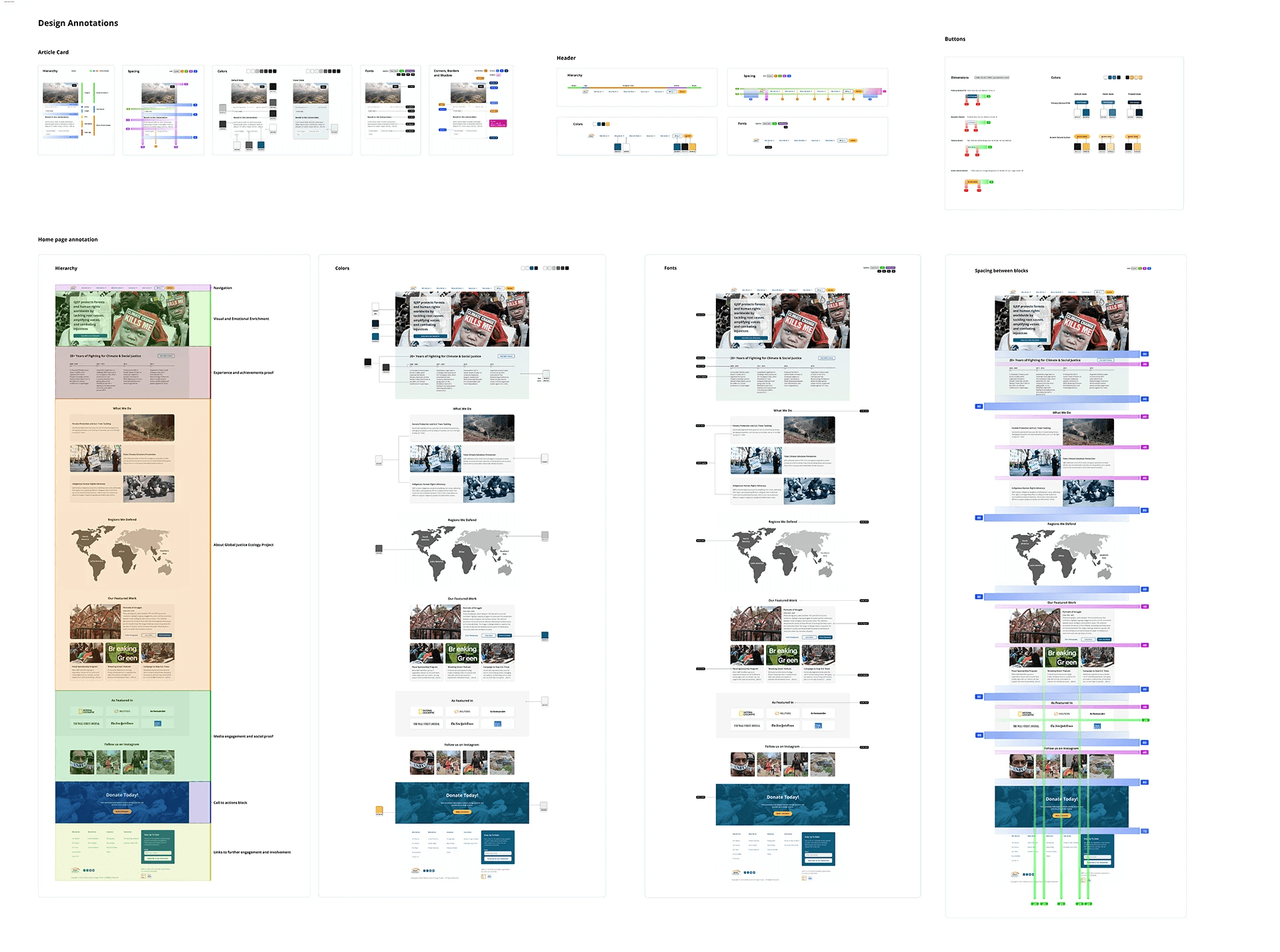
Established a clear visual hierarchy, making important information more prominent and encouraging user interaction.
GJEP Design System Foundations
Style Guide and UI Kit
UI Components & Design Patterns
Design Specifications
Results and Findings
Mission clarity: Most participants could summarize GJEP’s mission after reviewing the homepage, though some suggested adding more data visuals to illustrate impact.
Usability & clarity: Participants found the design easy to navigate, with minimal errors during tasks. Some noted the need for captions to provide additional context.
Enhanced engagement: Users described the homepage image as shocking and visually captivating, while the "What We Do" section and the countries we work in were identified as the most engaging elements.
Improved trustworthiness: Users rated the website higher on credibility, appreciating its transparency and the quality of content. However, many preferred to follow GJEP on social media or conduct further research before taking more active steps, such as donating or signing petitions.
